Introduction
✅ Why great design is no longer optional; it’s a brand necessity in 2025
✅ How creative visuals drive better engagement, retention, and trust
- Engagement: A stunning visual can stop a user from scrolling, leading to more likes, shares, and comments.
- Retention: A unique brand identity makes you memorable, helping you stay top-of-mind long after the first interaction.
- Trust: Professional, consistent design across all platforms shows you care about the details, which builds consumer confidence and trust.
✅ Why businesses are turning to expert graphic design services in Rajkot for standout branding
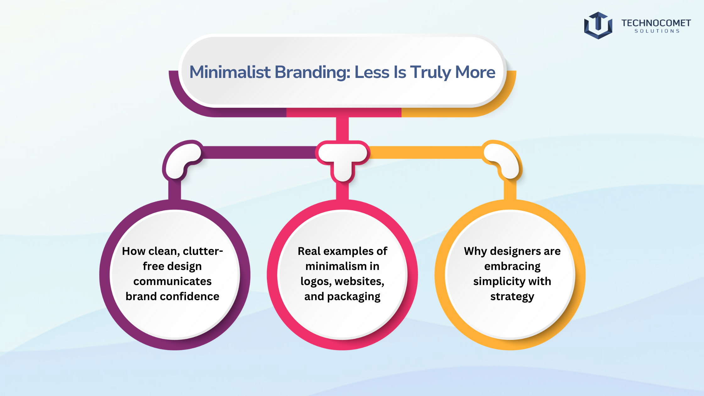
✨Minimalist Branding: Less Is Truly More
✅ How clean, clutter-free design communicates brand confidence
✅ Real examples of minimalism in logos, websites, and packaging
- Logos: Think of the simple, elegant logos of brands like Apple or Nike. They are instantly recognizable and timeless.
- Websites: Companies like Google use a minimalist interface with lots of white space to make the user experience intuitive and focused.
- Packaging: High-end cosmetic and tech brands often use minimalist packaging to convey a sense of luxury and sophistication. The focus is on the product itself.
✅ Why designers are embracing simplicity with strategy
💡 Pro Tip:
✨ Motion Graphics & Animated Visuals Steal the Spotlight
✅ How animation enhances storytelling across digital platforms
✅ Popular formats: reels, explainer videos, animated logos, UI elements
- Social Media Reels & Stories: Short, eye-catching animations are perfect for grabbing attention on platforms like Instagram and TikTok.
- Explainer Videos: Animated videos are incredibly effective for breaking down complex services or products into easy-to-understand visuals.
- Animated Logos: A subtle animation in your logo can add a sophisticated and memorable touch to your website or video intros.
- Animated UI Elements: Small animations on website buttons or icons (micro-interactions) can greatly improve the user experience, making it feel more responsive and intuitive.
✅ Tools Rajkot designers use to create scroll-stopping visuals
💡 Pro Tip:
✨ Bold Typography that Commands Attention
✅ Why fonts are doing more heavy lifting in modern design
✅ Creative use of type in posters, ads, and web headers
- Web Headers: Many modern websites now lead with a powerful, screen-filling typographic headline instead of a large hero image.
- Advertising: Brands are using expressive and artistic fonts in their social media ads and digital banners to stop the scroll and make an instant impact.
- Posters & Print: In print design, typography is often the star of the show, using size, color, and layout to create a dynamic and engaging composition.
✅ How designers are blending legibility with uniqueness
💡 Pro Tip:
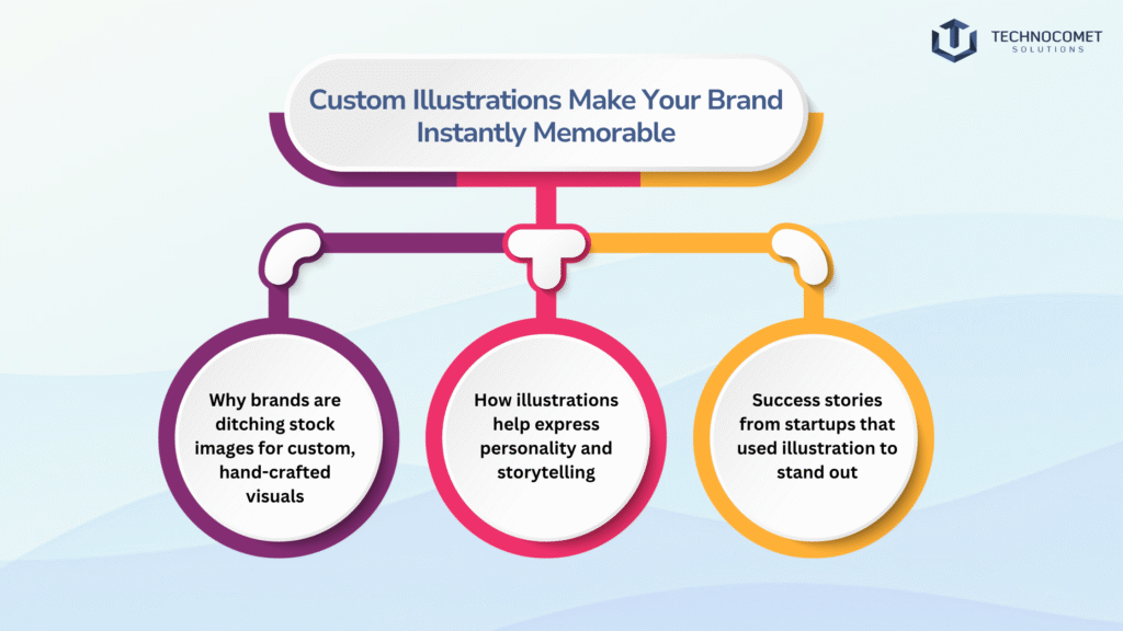
✨ Custom Illustrations Make Your Brand Instantly Memorable
✅ Why brands are ditching stock images for custom, hand-crafted visuals
✅ How illustrations help express personality and storytelling
- Personality: Are you quirky and fun? Sleek and professional? Warm and friendly? Illustrations can convey your brand's personality instantly.
- Storytelling: You can use a series of illustrations on your website or in a presentation to walk your audience through your brand's story or explain how your service works in an engaging way.
- Flexibility: Unlike photos, illustrations can be easily adapted with different colors and styles to fit any medium, from your website to your merchandise.
✅ Success stories from startups that used illustration to stand out
💡 Pro Tip:
✨Dark Mode and Dynamic Contrast for Modern Appeal
✅ The rise of dark-themed interfaces and their sleek, premium feel
Dark themes are often associated with sophistication, luxury, and focus. They make colors and graphics pop, creating a more dramatic and immersive visual experience. For brands in the tech, entertainment, or luxury sectors, a dark mode interface can instantly elevate their perceived value.
✅ How contrast boosts readability and visual impact
Whether in dark or light mode, contrast is key. High contrast between the background and foreground elements (like text) is essential for readability and accessibility. In dark mode, using vibrant accent colors against a dark background creates a powerful visual hierarchy, drawing the user’s eye to important elements like buttons and headlines.
✅ Design considerations for dark mode: icons, colors, and accessibility
Designing for dark mode isn’t as simple as inverting colors. It requires careful planning:
- Colors: Pure white text on a pure black background can cause eye strain. Designers often use a dark grey background with off-white text.
- Icons: Icons and logos must be designed to be clear and legible on both light and dark backgrounds.
- Accessibility: Ensuring there is enough contrast to meet accessibility standards (WCAG) is crucial so that users with visual impairments can still navigate your site easily.
💡 Pro Tip:
Design for both light and dark mode to meet user expectations in 2025. Giving users the choice to switch between themes is a simple way to improve user experience and show that your brand is modern and user-centric.
📌 From dynamic UIs to custom themes, TechnoComet Solutions delivers future-forward design. Our graphic design services in rajkot create high-impact visuals tailored to your brand’s modern appeal.
Conclusion
Reach out to TechnoComet Solutions today! 🚀💡📌